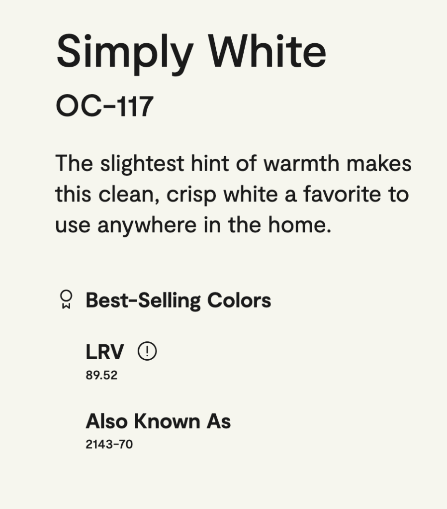
If there’s one thing we can all agree on in interior design, it’s that picking a white paint is hard. After a ton of research, heartache, and desperation, I finally chose Simply White by Benjamin Moore for our all-over interior paint job on the cabin. And I’m so happy I did.
Wait, so…Simply White is not simply white?
Simply White is a what is called an “off-white”. This just means that it isn’t a purely stark white like a piece of printer paper. Every off-white will have a different level of warmth, undertones, and brightness (“LRV” – light reflective value). Knowing what you’re looking for in these categories is critical for picking the best white for your space.
For the cabin interior, I wanted a vibe that is “modern cabin” – minimalistic while also cozy, modern while also rustic…elements that often seem in conflict with one another so it can be hard to get right. Here’s how I mapped that to my paint decision:
- Modern and Minimalistic: crisp, bright all white paint “drench” (walls, trim, ceiling, doors)
- Cozy and Rustic: a creamy off-white paint
Simply White fit this perfectly:
- Undertone: yellow
- Warmth: medium
- LRV: high at 89.5 (LRV scale is out of 100)
But what about…
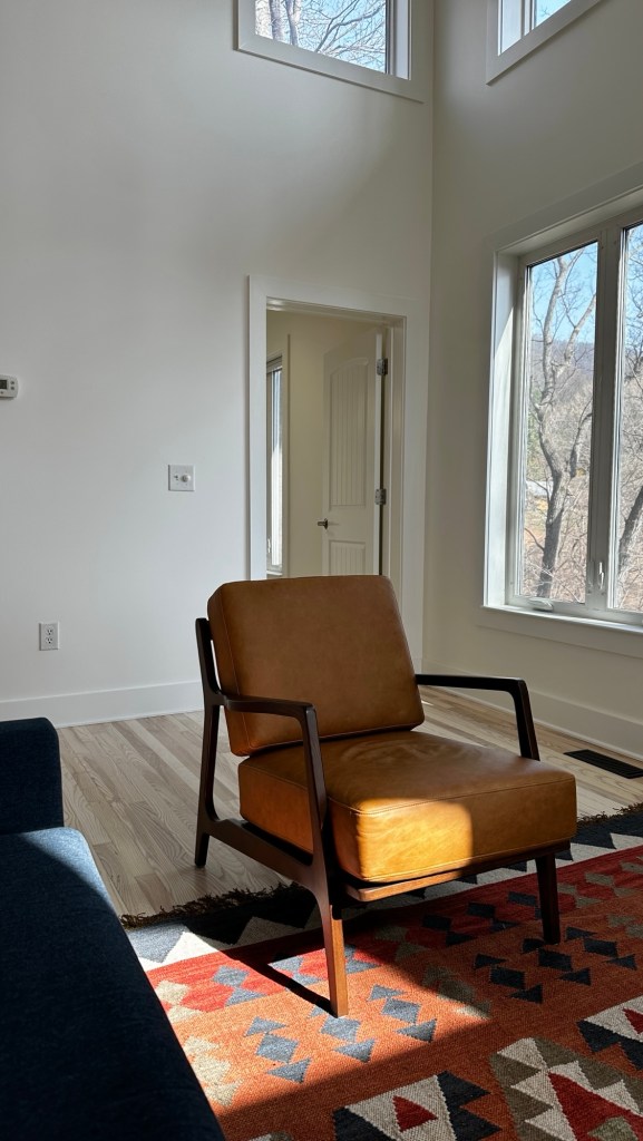
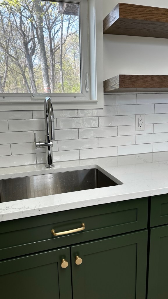
One of the biggest concerns people have with picking an off-white is if it will look too yellow. So far with Simply White, this definitely has not been an issue. When I look for it, I can see the yellow undertones – but it is more of a creamy tone, like fresh milk. It is more noticeable when up against a pure stark white. Or, in some lighting scenarios the undertones come out more – for example, I’ve noticed that the afternoon bright indirect light can show the yellow tones more prominently. Also, keep in mind that any white paint will reflect what is around it or coming in from outside, especially in bright light.
You should always test out paint colors before committing. Every space is different and everyone has different tastes and goals for their space. I highly recommend using Samplize (samplize.com) – they make large painted samples so you don’t have to actually paint on the walls and can easily move them around. They even offer bundles of different categories of white colors with the most popular options so you don’t have to pick your own.
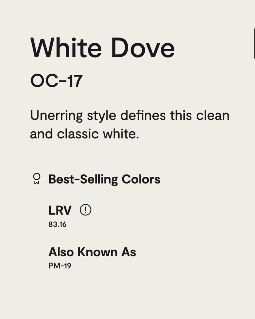
The competing color I was considering was White Dove, one of Benjamin Moore’s most popular off-whites. However in our space, White Dove looked almost gray and was too dark for what I was going for. I wanted something crisper and brighter.

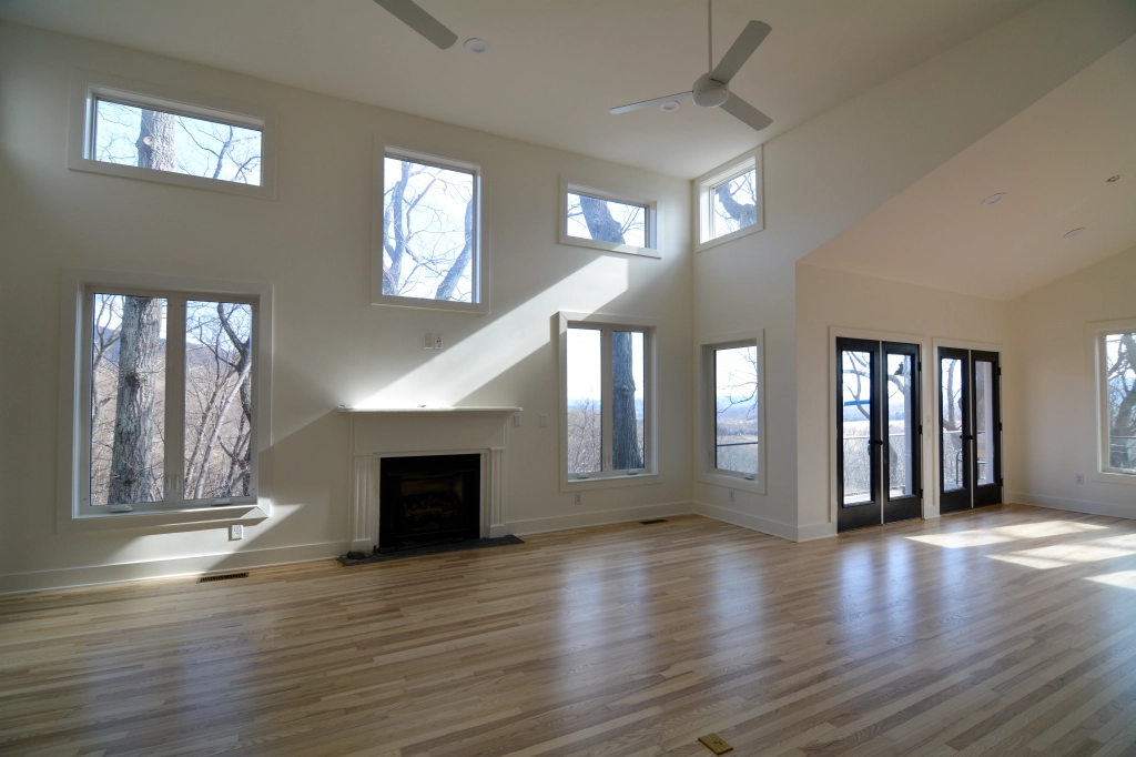
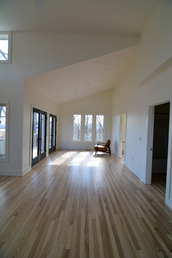
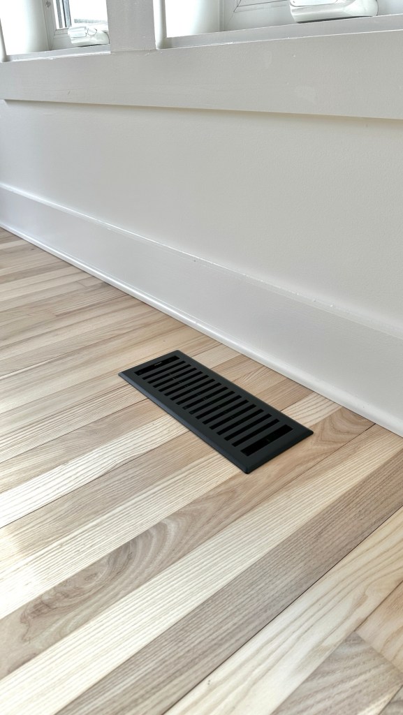
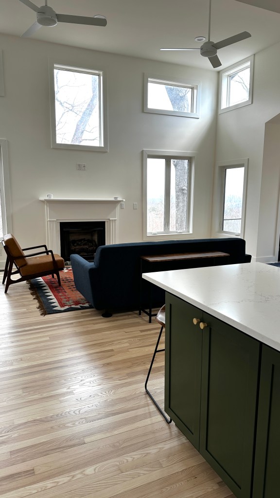
My other big decision was if we wanted to do a different white on the trim. That decision was an easy one – we did Simply White on everything (a “drench”): walls, trim, ceiling, and doors. Not only did I not want to have to pick a second white color (ha!), drenching has the effect of simplifying the space and making it feel bigger since there are no dividing lines in the color, which went with our design goals. The effect is more modern and minimalistic.
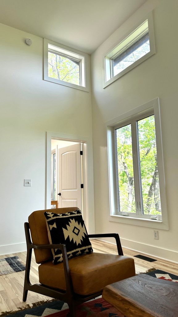
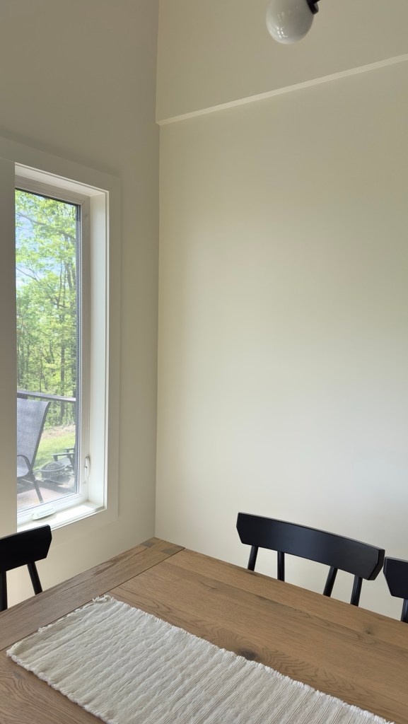
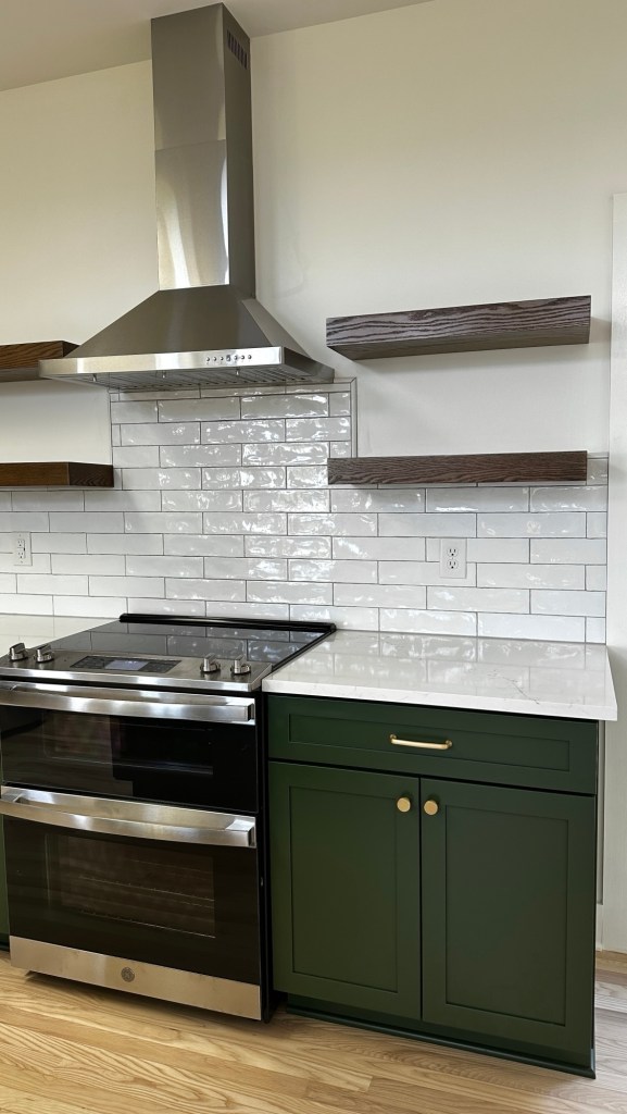
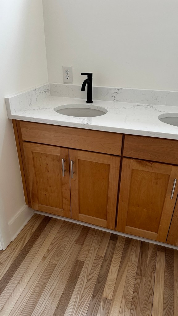
I’m super happy with how it turned out and would definitely pick Simply White again. I’m going a bit overboard on the photo dump, but hopefully it gives you a sense of how it looks in various settings and lighting.
Thanks for reading and I hope this post helps you on your white paint picking journey! Leave any comments or questions below!

Leave a comment